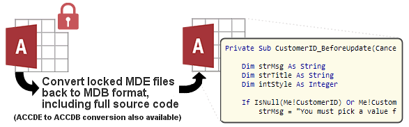
IN THE SPOTLIGHT: MDE to MDB Conversion Service
(also supports: ACCDE to ACCDB, ADE to ADP, etc)
IN THE SPOTLIGHT: Access Database Repair Service
An in-depth repair service for corrupt Microsoft Access files

IN THE SPOTLIGHT: vbWatchdog
VBA error handling just got easier...

" vbWatchdog is off the chart. It solves a long standing problem of how to consolidate error handling into one global location and avoid repetitious code within applications. "
- Joe Anderson,
Microsoft Access MVP
Meet Shady, the vbWatchdog mascot watching over your VBA code →
(courtesy of Crystal Long, Microsoft Access MVP)
IN THE SPOTLIGHT: vbMAPI
An Outlook / MAPI code library for VBA, .NET and C# projects
Get emails out to your customers reliably, and without hassle, every single time.
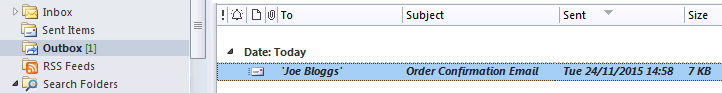
Use vbMAPI alongside Microsoft Outlook to add professional emailing capabilities to your projects.
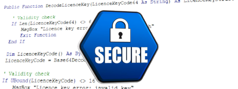
IN THE SPOTLIGHT: Code Protector
Standard compilation to MDE/ACCDE format is flawed and reversible.
Provided by Allen Browne. Created: September 2008. Last updated: May 2009.
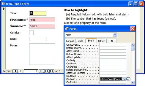
Would you like your forms to automatically identify the fields where an entry is required?
How about highlighting the control that has the focus, so you don't have to search for the cursor?
This utility automatically does both in any form in Form view (not Continuous), just by setting a property.
In the screenshot (right), Title is highlighted as the current field (yellow), and the name fields are required (red background, and bold label with a star.) Modify the colors to whatever style suits you.
To use this in your database:
Do not substitute the name of your form in the expression above, i.e. use the literal [Form] as shown.
To highlight the required fields only, use:
=SetupForm([Form], 1)
To highlight the control with focus only, use:
=SetupForm([Form], 2)
If your form's OnLoad property is set to [Event Procedure] add this line to the code:
Call SetupForm(Me)
Change the color scheme by assigning different values to the constants at the top of the module. mlngcFocusBackColor defines the color when a control gains focus. mlngcRequiredBackColor defines the color for required fields. Use RGB values (red, green, blue.) Note that:
(You could modify the code with the CaptionFromHeader() function from the FindAsUType utility, so as to bold the labels in the Form Header over the columns.)
Note that the labels will not be bolded or have the star added if they are not attached to the controls. To reattach a label in form design view, cut it to clipboard, select the control to attach it to, and paste.
You can use the code without understanding how it works: this explanation is for those who want to learn how it works, or modify what it does.
The main function — SetupForm() — accepts two arguments: a reference to the form you are setting up, and an integer indicating what parts you want set up. The integer is optional, and defaults to all bits on (except the sign.) We are actually only using the first two bits (for required and focus-color); you can use the remaining bits for other things you want to set up on your form. SetupForm() examines the bits, and calls separate functions to handle the required and focus-color issues.
The OnGotFocus event fires when a control get focus, and its OnLostFocus event when focus moves away. We can therefore use these events to highlight (by setting its BackColor) and restore it. But we needs these events to fire for each control that can get focus. SetupFocusColor() assigns these properties for us when the form loads.
So, SetupFocusColor() loops through each control on the form. It looks at the ControlType property, and skip anything other than a text box, combo, or list box, and controls that are already using OnGotFocus or OnLostFocus. It then sets property values this (using Text0 as an example):
| Property | Setting | Comment |
| On Got Focus: | =Hilight([Text0], True) | Text0 will be highlighted when it gets focus. The square brackets cope with odd field names. |
| On Lost Focus: | =Hilight([Text0], False) | Text0 will be restored to normal when it loses focus. We will look in the Tag property to find what that is. |
| Tag: | UsualBackColor=13684991 | This is the color to restore it to when it loses focus. We append (after a semicolon) if Tag contains something. |
Assigning these properties automatically when the form opens makes it easier to design and maintain.
Now, when any of these controls receives focus, it calls Hilight(), passing in a reference to itself, and a True flag. When it loses focus, it calls Hilight() with a False flag.
If the flag is True (i.e. the control is gaining focus), Hilight() simply sets its BackColor to the value specified in the constant mstrcTagBackColor. You can set that value to any number you wish at the top of the module. Just use any valid RGB (red-green-blue) value.
If the flag is False (i.e. the control is losing focus), Hilight() needs to set it back to its old color. Our initialization — SetupFocusColor() — stored the usual background color for the control in its Tag property. Tag could be used for other things as well (typically separated by semicolons), so we call ReadFromTag() to parse the value from the tag. If we get a valid number, we assign that to the BackColor. Otherwise (e.g. if some less polite code overwrote the Tag), we assign the most likely background color (white.)
SetupRequiredFields() is the function that provides the formatting for fields that are required.
Again, we loop through the controls, ignoring anything other than text box, combo, or list box. We also ignore it if its Control Source is unbound (zero-length string), or bound to an expression (starts with =.) Otherwise the Control Source must be the name of a field, so we look at that field in the Recordset of the form. If the field's Required property is true, we will highlight it. We also check if the field's Validation Rule includes a statement that it is not null: some developers prefer this to the Required property, as it allows them to use the field's Validation Rule to give a custom message.
If we determined that the field is required, we set the BackColor of the control to the color specified in the constant mlngcRequiredBackColor. Then we call MarkAttachedLabel() to format its label as well. The reason for using a separate function here is that the control may not have an attached label, so an error is likely. It's simplest to handle that error in a separate function.
If there is an attached label, it will be the first member of the Controls collection of our control — Controls(0). If there is no attached label, the error handler jumps out. Otherwise we add the asterisk to its Caption (unless it already has one), and sets it to bold. Using bold looks good on continuous forms but does not show on datasheets. The asterisk does show in the Column Heading in datasheet view. You can use whatever formatting suits you.
| Home | Index of tips | Top |
Rate this article: 
This is a cached tutorial, reproduced with permission.
Have your say - comment on this article.
What did you think of 'Flagging required fields in forms'?
1. | Lawrence says... | 10 Feb 2010 |
Great article and I was able to make use of this immediately. I used to set the GotFocus and LostFocus manually and what a pain. Since most of my forms are unbound, I made the following changes to the SetupRequiredFields() and called it SetupRequiredFieldsTag(). This make use of the Tag property to determine whether it is required or not. For Each ctl In frm.Controls With ctl Select Case .ControlType Case acTextBox, acComboBox, acListBox strTag = UCase(.Tag) If InStr(strTag, "REQUIRED") <> 0 Then .BackColor = mlngcRequiredBackColor Call MarkAttachedLabel(ctl) End If End Select End With Next It works like a charm. Thank you very much for sharing! | ||
TWINBASIC LTD (Company No. 16590181, VAT No. GB497509439)
Terms | Privacy | Sitemap | X (Twitter)


